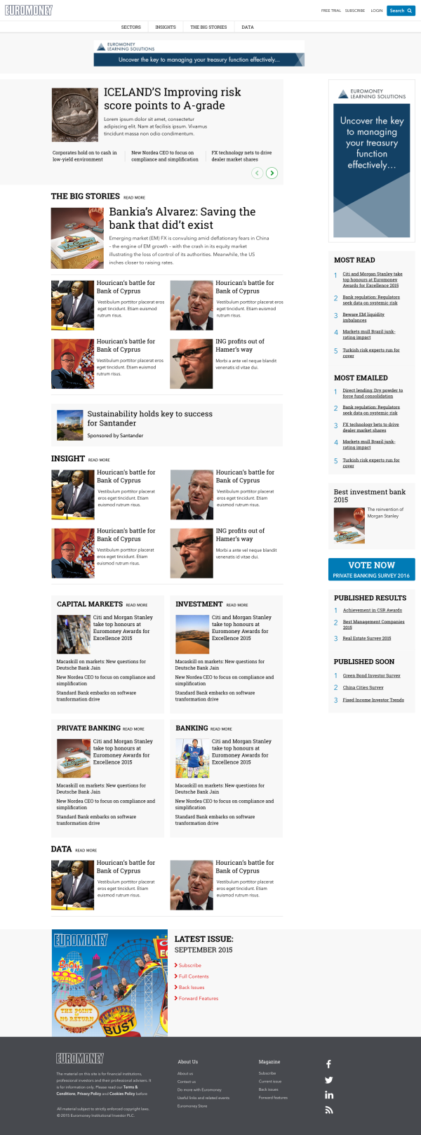
One of the founding publications of Euromoney PLC, Euromoney magazine has been around a while. As in most such cases there tends to be a pull towards business as usual and while the print material had seen innovation and refresh, the digital version had been somewhat left out in the cold with little investment and as such suffered from a dated look and experience, translating to a material impact on subscriptions and revenue.
Working with a motivated business team we were tasked with providing the first nudge into a fresh new experience. Some of the main challenges were around integration with a legacy CMS and a tiny budget more suited to a proof of concept and one that didnt extend to content migration, resulting in assets not well suited to a more modern layout.
Our intial steps focussed on the experience and consolidating a raft of different content types and presentation patterns into a more manageable and recognisable set, to reduce user confusion and increase content circulation. Working with the senior business stakeholders we refined and simplified the site taxonomy and IA as well as reviewing the advertisting strategy.
Given the nature of the legacy CMS and content there were many edge cases requiring individual 'hacks' and in some areas these are still apparent however, as a first pass at modernising the publication it was a great success, achieved at serious speed and on a miniscule budget.
So much so that it has in some ways been a victim of its own success, providing the business requirements well enough that the forcast iterations were descoped and subsequent re-platforming has seen little change to the UI.
It's a great example of how just enough design can have as much material success as something we might normally consider more polished.

Some of the planned iterations included extending the UI to include a richer format article page for higher value sponsored and featured content.
At the time of writing this has yet to be released.
