When word gets around that you can produce good work, that's a great thing, when it comes with the knowledge you did so for very little money that get's people interested and can be both a blessing and a curse.
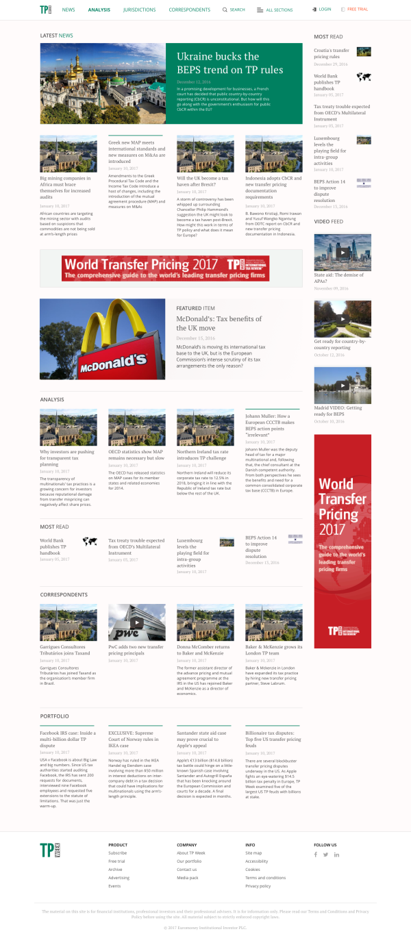
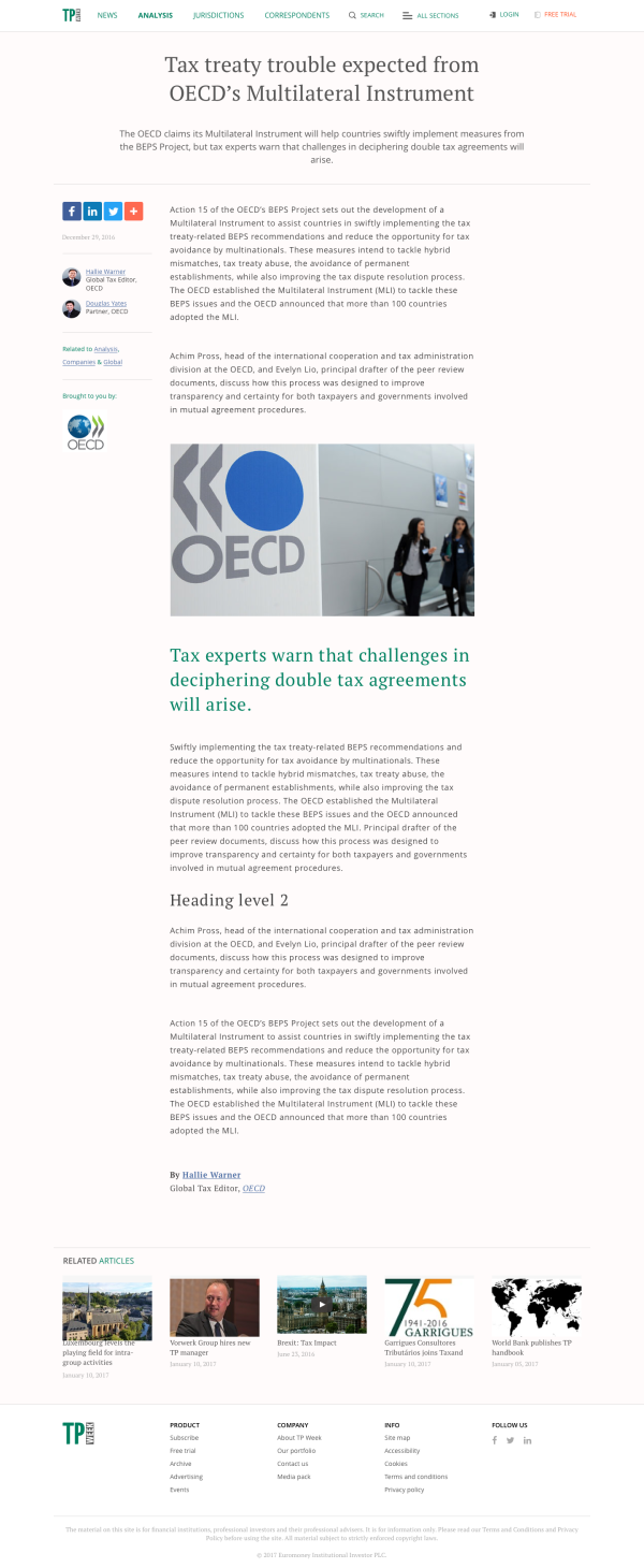
Following euromoney.com my team received a number of requests to repeat that success. One such was TP Week, with a view to providing a template for rapid site creation across the division's various properties. As a minor partner in the group, budgets were always small or non-existent so something simple that does the job was certianly in order. Given legal content can tend to be a touch on the dry side, keeping it simple and readable was also considered to be a desirable angle.
Repeating the process that served us well before we worked with the stakeholders to streamline the taxonomy and where necessary convince that less is more. Educating on the value of mobile and by extension responsive first rather than as an afterthought.
Resulting in a a format that has perfomed well for the division. While not one I initially considered a great work, it's one I'm always pleasantly surprised by when I return to have a look. Simple yet effective.

