This was the big one, from my first day at Euromoney PLC I'd wanted to get my hands on institutionalinvestor.com. Their online publication was alright, it got attention and the occasional feature update, but overall it had so much potential for more and as one of the flagship Euromoney PLC properties was always tantalisingly out of reach.
Then a funny thing happened, new budgets coincided with a shift in advertising tracking and a dip in subscription figures.
The brief was to revamp their online presence and take a fresh look at how revenue was generated from advertising, sponsorship and other channels. The II team have a very strong design arm in NYC who were tasked with the initial brand concept, myself and my team joined them on that journey.
Working with the creative director in NYC, remote designers in Mexico City and the usual off shore teams for implementation, QA etc. To that mix we brought consultation around evolving the brand online and putting the customer at the centre.
We all know that advertising as a revenue generator is suffering. In this case there are still good numbers involved, but with ad visibility being tracked more maturely we worked with the stakeholders to look at approaches such as sticky elements that didn't overtake the experience. As part of the customer first approach we also consulted on removing the cluter, focussing on the content and the reading experience in an effort to ensure retention and conversion.
With those pieces of the puzzle in mind we set out to look at the experience. To foster smoother working we introduced tools such as Sketch and Invision to our distributed team mates and started the process of an atomic approach to design, leading to well developed pattern and component libraries. These in turn have saved hours of time and re-work when dealing with subsequent requests.
While we were doing this the whole product was re-platformed to a modern end-to-end publishing and workflow tool, which in turn was plumbed into our standard web platform. It involved a lot of content migration and yes, a few sacrifices to the patterns we could implement in the core content, but pattern libraries and live component libraries again showed their strength when we had to rethink our ideal for the practical.
Working with the II team on-site in NYC and remotely was really refreshing and positive. The site has gone from strength to strength, encouraging editors to put the same attention into online content as they would from print.
Since the first release other properties have been transfered into the II publication and the anticipated re-work to account for them hasn't been necessary due to the performance of the initial release.
Just recently it was announced that the business would be moving to digital only, a huge step, but also a glowing valiation of the hard work that went into the digital platform.
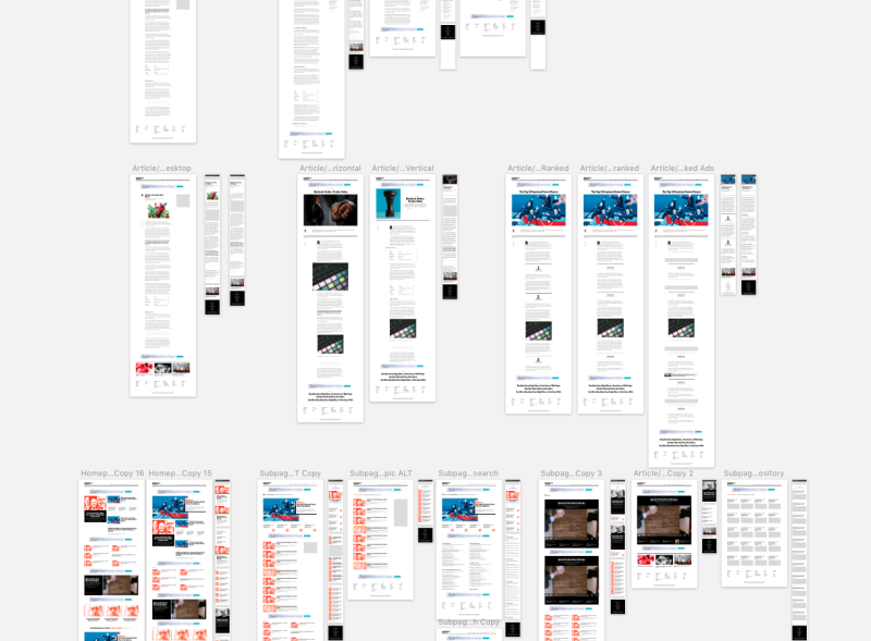
To be honest it's best seen live since all things evolve in the implementation, but here are a few of the original design concepts to give an outline of where we started.


