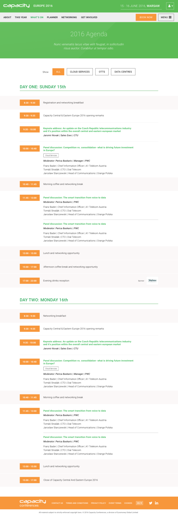
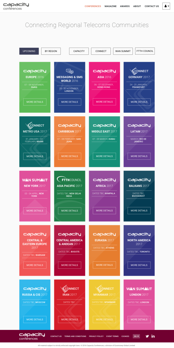
After the success of ITW I had a number of conversations with the Capacity business regarding the rest of their events. While part of the family, ITW has always stood alone, the rest of the events they manage come under one core brand, with a number of locale and business specific variants.
The team were keen to take advantage of the appreciation for ITW and keep the ball rolling with a revamp of the rest of their event properties. It was a really great challenge to have earned, but not without it's complexities. The exisiting web presences for the Capacity events suffered from many of the same issues as the original ITW. Too much content with too little structure, fragmented branding and a fractured relation to their parent and siblings.
We worked with the business stakeholders to put together a brief for how to transform these events into a modern experience. Given they are so well known within their industries the focus was on siplifying the online experience and bringing it up to date to feel like a peer to it's rivals. A crucial goal from the business was to strengthen the overall brand by brining the events under a single design system.
While each event had a common brand pallette format they tended to stray off-piste with a few custom logos and various materials cropping up. No great suprise for so many events with such niche content and an undestandable approach from local marketing teams.
The brief was to follow the approach of ITW, bold, colourful and simple. Re-platform to bring all the management advantages we had already proven there. Strandardise across top level logo's for the various event series and differentiate with copy and colour for the various events within each series. And importantly provide an improved parent entity to house them all as a family, with two-way relationships and a strengthend overall identity.
An ambitious goal and one thing that was very clear was that things would need to be kept simple to allow local copy to speak and be heard while keeping things flexible enough that core branding would remain relevant under the context of local events.
We were fortunate enough to have well defined brand colour palettes for each event and concensus from stakeholders on the handling of logos and other brand elements. From this we were able to concentrate on evolving a core concept with regular review points and were able to put together a system that functioned within our design assets using early features in Sketch to support flexibility, right through to a component library and frontend stack that was capable of generating assets for and adapting to each event series brand and sub-brand. A lot of the lessons learned here went on to inform our overall approach to pattern libraries and design systems.
So, what went wrong?
In itself the work we did was really successfull and enjoyable. Where we learned a valuable lesson was in how this all meshed with business priorities. When we started this work everything was lined up for a bit of a run ahead followed by a standard Agile Scrum project. Unfortunately due to other requirements the backend team were moved to another piece of work shortly after we kicked off. Given budgets and timelines we were asked to continue our work with a view to the backend team joining the process later on. At the time I had concerns about how that would pan out however, we were asked to continue and so we did.
In the end the backend team did loop back in. A little later than anticipated, but things were going well. The bulk of our work was complete, with some oversight and assistance to manage the inevitable changes that occur in a real world environment. I believe the product was about 90% of the way to complete when the wheels fell off.
The problem, while this had been happening there were changes to business requirements. Some new events were starting up, with radicly different branding, no one had informed the team and at the same time there were fundamental shifts in the management of the events. The outcome being that the brakes were put on and shortly thereafter a decision came down that everything would be starting from scratch with new requirements.
So, disappointing, but a valuable lesson. It's also a cautionary tale that while the agile process may be well understood by those involved, if that doesn't reach all the way to the top then old-school waterfall problems can still de-rail an otherwise great project. So for posterities sake below are a few examples of what could have been.


